Acadia Workforce, Inc.

Homepage design proposal · 2026

Acadia Workforce, Inc.

Acadia Workforce — Homepage Options

Four homepage directions built on the Acadia Workforce logo and its blue-and-white palette. Every option includes the same content, navigation and contact details. What changes is the composition, typography and personality.

Brand palette

  • Brand blue#078FCE
  • Deep blue#0069A6
  • Navy#063A69
  • Light blue#EFF8FD
  • Logo green#17652A

The four layouts

Option 01

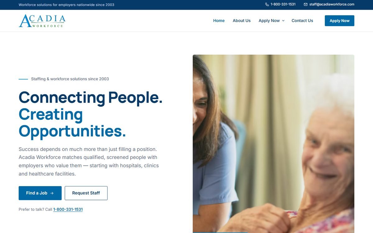
Classic Premium Corporate

Traditional and trustworthy. A balanced two-column hero, a utility bar with phone and email, and calm, ruled sections.

  • Most established and conventional
  • Clear job seeker / employer split panels
  • Lowest risk; easiest to maintain
View Layout: Classic Premium Corporate (opens in a new tab)

Option 03

Minimal Blue & White Elegance

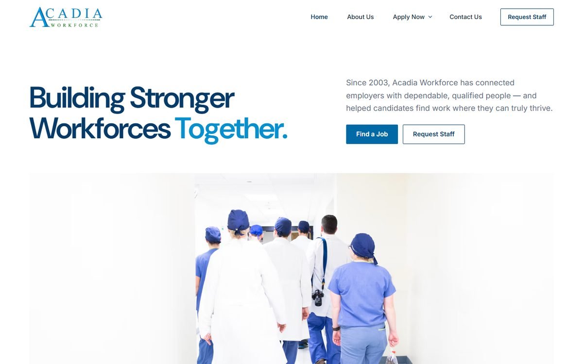
Quiet and timeless. A typography-led hero with one panoramic photograph, hairline dividers and generous white space.

  • Most refined and minimal
  • Fastest to read; very little visual noise
  • Ages well; easy to extend
View Layout: Minimal Blue and White Elegance (opens in a new tab)

Option 04

Bold Blue Corporate

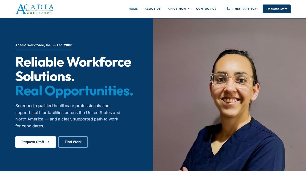
Confident and contemporary. A dark navy hero, strong blue blocks, a four-step recruitment process and a dedicated screening section.

  • Boldest brand presence
  • Puts quality assurance front and center
  • Phone number always visible in the header
View Layout: Bold Blue Corporate (opens in a new tab)
At a glance

Compare the four options

Comparison of homepage options by tone, audience emphasis, hero style and complexity
OptionToneBest forHeroComplexity
01 — Classic Premium CorporateTraditional, trustworthyBoth equallyTwo-column text + photoLow
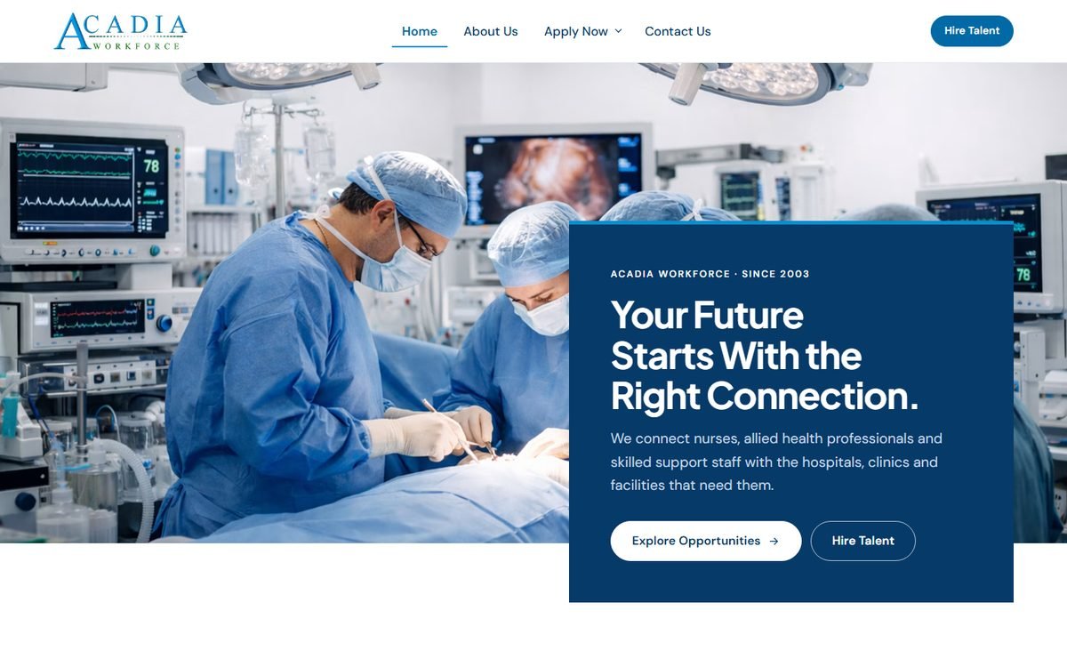
02 — Modern Blue RecruitmentModern, energeticCandidatesFull-width photo + navy panelMedium (photo-dependent)
03 — Minimal Blue & White EleganceElegant, understatedBoth equallyTypography + panoramic photoLow
04 — Bold Blue CorporateBold, contemporaryEmployersNavy split with photoMedium